
Low / No Budget Set Design : High Production Values for Low $
-
To me, the biggest thing that really calls attention to a low / no budget short is bad sets, backgrounds, lighting, etc... You can fix lighting up to a point with little money, but set design is one of the biggest things that's never talked about that can have a huge impact on your look of your film or short.
And it can be one of the most costly. Part of the reason a lot of these shorts have bad sets is because they have no money to try and make things look better and/or no crew to try and make it look good. So they shoot where they can shoot free and in locations they can't change or don't have time to change.
So I'd like to start this topic to brainstorm ideas and find links online of set designing and trying to get more "production value" in your films with little to no money. I found this link: http://smashortrashindiefilmmaking.com/?page_id=1104
This is both a good example of low budget set design AND special effects since this is a forced perspective shot. Anybody else have links or tips on this topic? -
One advice when shooting in a (private) room/flat/house:
If there is no need for some thing to be there, than there is no need of that thing to be there!
Our normal environment is packed with things - movie sets are as boring as possible. Look at your room, there are lots of big and small things everywhere. Now watch a movie scene of a living room, it consists only of the things needed for a specific purpose in that scene. Because everything else will distract the audience.
Good example: Pulp Fiction (e.g. when the pros visit the boys to get the suitcase)
If you want to shoot in a normal (living) room - get everthing you don't really need in another room. This will also give you and your talents more space to work. Move even things that wont be seen in your shots out, because it will still reflect light or cast shadows and "be there".
No costs, (if everybody helps) not much of an effort, doesn't need much time. -
@Psyco Couldn't disagree more. First off, with low/no budget filmmaking you have limited crew, limited money and limited time or a combination of each. I would never remove stuff from a set I was able to secure. That's time I would rather put to blocking, rehearsing, lighting, etc... And if the room as is, doesn't fit the scene, then you shouldn't have picked it or you need to rewrite the scene to fit. Plus, most "normal living rooms" look much more boring than you think. Most of the time you'd have to ADD stuff to it to make it look more interesting.
AND I just happened to watch Pulp Fiction the other day, again, and the simplicity of the guys room is very deceptive. There's the wall fixture, the shadow behind Jules, the window and the curtain rods next to the window with no curtains because of the twin blinds. How far the blinds go down, the shining chrome of the chair next to Jules, the shadows on the carpet, etc... All that is deliberate and the lighting and shadows are deceptively complex than at first glance.
Even the shot with Marvin is much less simple than it looks. The shadow behind Marvin, the door jam line behind him, the room corner, the shadow at the top of the room corner in a triangle shape, the door trim, the door trim shadow, the door pattern. Looks like nothing, but that shot has lots of deliberate depth and shading done to it that most people don't realize was done. Also the paint has texture and coloring that is most likely deliberately created.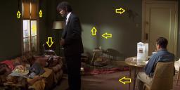
 PulpSet.jpg1280 x 544 - 151K
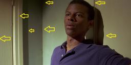
 PulpSet2.jpg1280 x 544 - 118K
 -
@CRFilms
Look at the pictures again. There are no posters or pictures on the walls, there are no books, magazines,... or even shelfes in that shot. Can you imagine 4 kids hanging up in that flat and it still look that tidy?
If you really look at it, it doesn't look like a real flat - it is way to clean and simple.
Thats what I mean, there is nothing bright or coloured that distracts the audiance.
I don't know how you are living - but at least my livingroom is much more colourfull and has many more things to look at, e.g. a book shelf with books of many different colous and sizes - you don't want something like this in a shot (except your talent is a nerd/freak and at least one book is playing an important part in your shot).
Lightning and placing shadows is something absolute different - thats where you add things.
Keep it as simple as possible or it will just look like homevideo. -
Simple like the bar where Marcellus tells Butch about "Pride". Or simple like Lance's house when they're going to stab Mia in the chest with a foot long needle....nothing distracting in the background at all....
And what I'm saying about lighting is you have to take that into account when your designing the set picking out locations. And if you have a location you can't change, I'd rather spend 5 minutes figuring out a creative script reason for why the location looks like that than spend hours re-arranging stuff. There's nothing you can't explain away with dialogue...talk is cheap.
It doesn't matter how "busy" the background is...I'm looking at backgrounds because the story doesn't keep my attention and I want to see why these vids don't look good. If the story, dialogue, acting kept my attention, I wouldn't notice the background.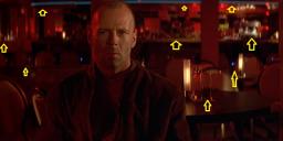
 Butch.jpg1280 x 544 - 118K
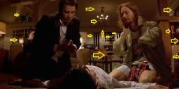
 Nedle.jpg1280 x 544 - 167K
 -
Totally agree with CRFilms. The less there's going on in the room/location, the more effort, skill and time you'll have to put in to create an atmoshpere or simply an interesting image ('Marvin' example). For no/low budget that's not a good advice imo, I'd say stay away from white walls and rather empty interiors.
-
Set-design is hard... But here are a few guidelines that I have:
1. Stay away from the walls: As we saw in the Marvin picture, walls can look great, with some nice atmospheric lighting and good planning. But most of us won't have that ability. And walls are usually our greatest enemy, as these are empty and quickly look "boring". So it's a good idea to move out a bit from the walls. For exmple, create some space, usually about 3 feet or more is enough for a person to not "blend into" the wall or, even more.
2. Clean it up: There's an old expression that goes: Keep it simple, stupid. Look around the room and see what the basic components in the furniture are. Usually, most "normal" rooms have all sort of stuff that's just laying around. That is something you DON'T want. All the random stuff should have a reason to be there. Plus a tidy room is a lot easier to work with. But mostly it boils down too an old expression: Keep it simple, stupid.
3. Devil's in the details: This is related to the above point. As moving around big stuff is something that takes time, instead, focus on the little things and draw focus on them. Use props to your advantage and highlight these, as these can tell a lot about your character.
But the last part is what I think is the most important:
4. Try to get an atmosphere: While it sounds silly, most people will accept the more you do if the atmosphere you want to capture is spot on! This is easier than one might think, but usually just adding some light/color, an object or some movement can make it all the more interesting. For example a TV-bumper I was AC'ing they had a pinball machine that when it came into the scene really heightened everything. But it can be even simpler. I was DoPing a film where we just used some different colored lights to really make the scene work all the better. One scene we were in a bar and one character was watching TV. We used a cold CFL softbox with a CTB filter infront (the rest was Tungsten) so we got a very blue light and then just used somebody with some papers occasionally waving back and forth. It created a sense of space and made the scene come alive. Or in another shot we saw the bar, which had these refrigerators where we stuck another CFL light underneath, creating a cold light coming from there, again making the bar itself stand out from the rest of the room. -
I am considering building a controlled interior sound stage with lights and mics suspended from the ceiling on booms. For backgrounds, I'm wondering if it's now practical to invest in overlapping 2-meter wide matte-white vinyl roll-down screens, wall-mounted 3 meters above the floor. My thought is that with After Effects Rotobrush, it's no longer necessary to shoot dialog shots in front of live background scenery, and that neutral white backdrops produce cleaner chroma keys than green screens. Particularly with narrow DOF shots, it seems to me that compositing in a blurred background in post can be quicker, cheaper, and offer more control than properly lighting and micing actors amidst the random decor and furnishings of a real-life set.
-
@LPowell
That all might be true. But a cold white cyc isn't going to be conducive to getting the best performances from your actors. Actors love props, wardrobe, make up and sets. They truly respond emotionally to those things. Of course if you doing local weather broadcasts or even infomercials, then it's fine.
-
@brianluce
I do plan to shoot establishing and action shots at off-site locations with actors. It's the close-up dialog shots I'm thinking would work better on a controlled sound stage. Foreground props would be brought in for the actors to interact with. It's just the background that would be composited in post. -
@LPowell I'd thought of "white screen" and I may have done a test in the past and wouldn't the talent's eye balls key out? The white's of their eye's" would literally be the background, no?
-
@CRFilms
Yes, a white color-key would detect bright foreground objects as well. However, AE's Rotobrush isn't a simple color-keyer, it's a sophisticated motion-tracking edge-detector. Here's a tutorial on how it works:
http://tv.adobe.com/watch/after-effects-cs5-feature-tour/rotoscope-with-rotobrush/ -
@LPowell Cool, BUT....the words low and no budget are in the topic title for a reason and AE CS5 is out of my budget. I'm using Sony Vegas Studio because it's the cheapest editor that offers the most features. The full price of Adobe Premiere and Effects is around $1000. I'd rather spend that money on, lights, sound hardware, and rigs to make my footage look better in cam.
Edited the title to better reflect what I mean.
Start New Topic


Howdy, Stranger!
It looks like you're new here. If you want to get involved, click one of these buttons!
Categories
- Topics List23,980
- Blog5,725
- General and News1,353
- Hacks and Patches1,153
- ↳ Top Settings33
- ↳ Beginners255
- ↳ Archives402
- ↳ Hacks News and Development56
- Cameras2,362
- ↳ Panasonic991
- ↳ Canon118
- ↳ Sony156
- ↳ Nikon96
- ↳ Pentax and Samsung70
- ↳ Olympus and Fujifilm100
- ↳ Compacts and Camcorders300
- ↳ Smartphones for video97
- ↳ Pro Video Cameras191
- ↳ BlackMagic and other raw cameras116
- Skill1,961
- ↳ Business and distribution66
- ↳ Preparation, scripts and legal38
- ↳ Art149
- ↳ Import, Convert, Exporting291
- ↳ Editors191
- ↳ Effects and stunts115
- ↳ Color grading197
- ↳ Sound and Music280
- ↳ Lighting96
- ↳ Software and storage tips267
- Gear5,414
- ↳ Filters, Adapters, Matte boxes344
- ↳ Lenses1,579
- ↳ Follow focus and gears93
- ↳ Sound498
- ↳ Lighting gear314
- ↳ Camera movement230
- ↳ Gimbals and copters302
- ↳ Rigs and related stuff272
- ↳ Power solutions83
- ↳ Monitors and viewfinders339
- ↳ Tripods and fluid heads139
- ↳ Storage286
- ↳ Computers and studio gear560
- ↳ VR and 3D248
- Showcase1,859
- Marketplace2,834
- Offtopic1,319


